
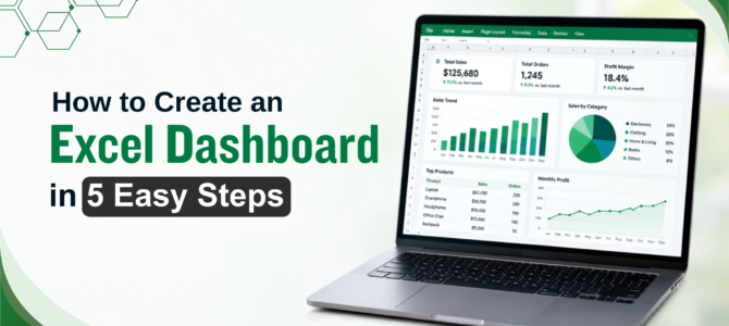
Creating an Excel dashboard is a practical way to turn raw spreadsheet data into a clear visual report that makes important numbers easier to understand and track. If you are wondering how to create an Excel dashboard for data analysis, the process starts with preparing clean data, defining the right KPIs, and using tools such as Pivot Tables, Pivot Charts, Slicers, and formulas to bring everything together. This guide takes you through the process from organising your data to designing a dashboard that makes key trends and performance figures easy to see.
What Is an Excel Dashboard, and Why Is It Useful?
An Excel dashboard is a visual report that brings important metrics, charts, and filters together in one place. Instead of searching through multiple worksheets, users can view key figures, compare results, and identify trends from a single dashboard.
Dashboards can be useful for sales reports, financial analysis, HR tracking, and project monitoring. Once the underlying data is organised properly, the dashboard can also be refreshed as the source data changes, reducing the need to rebuild the same report each time. For more background on Excel dashboard basics, see our related guide. The rest of this article focuses on how to create an Excel dashboard from your own data.
Before You Start: Prepare and Clean Your Data
A dashboard is only as reliable as the data feeding it. Charts built on top of duplicate rows, inconsistent date formats, or stray blank cells tend to produce numbers that look confident but are quietly wrong, which defeats the purpose of building a dashboard in the first place.
Before building any visuals, raw data needs to be cleaned and structured properly. Our guide on Power Query and Power Pivot for data cleaning covers this preparation step in detail and is worth going through first if the source data has not been cleaned recently.
5 Steps to Build an Excel Dashboard
Creating an Excel dashboard involves organising your data, choosing key KPIs, creating Pivot Tables and charts, adding Slicers, and arranging everything into a clear layout. The following five steps explain how to create an Excel dashboard from start to finish.
Step 1: Define Your Key Metrics (KPIs)
Before you open a blank sheet, stop and think about the question your dashboard needs to answer. If you are building a sales dashboard, that might mean total revenue, monthly sales, sales by region, and how close each team is to its target. If you are building an HR dashboard, you are more likely tracking headcount, employee turnover, and attendance instead.
Getting clear on this first tells you exactly which data and which charts you need, and it saves you from ending up with a dashboard packed with numbers that do not actually help you make a decision. It is easy to add “just one more chart" because the data is sitting right there, but if it does not answer one of your core questions, it usually just adds noise.
Step 2: Organise Your Data and Create Pivot Tables
Once you know your metrics, the next job is turning rows of raw data into something summarised and usable. Pivot Tables are the most dependable way to do this in Excel, but they only work well if what you feed them is clean.
Before you create any Pivot Table, take a few minutes to organise your source data into a proper Excel Table, with clear column headings and consistent values in every row. This one step makes your data far easier to manage, and it gives your Pivot Tables (and everything else on your dashboard) a reliable source to pull from. Once that is done, summarise the metrics you defined in Step 1 using Pivot Tables. A well-built Pivot Table becomes the engine behind every chart and KPI card you add later, so it is worth getting it right at this stage rather than fixing it after the fact.
Step 3: Create Charts and Add Slicers
With your Pivot Tables ready, it is time to make them visual. Pivot Charts, whether bar, line, or doughnut, turn summarised numbers into something you can read at a glance instead of a table you have to study.
Adding Slicers and Timeline controls on top of these charts is what actually makes your dashboard interactive rather than a static snapshot. This is the part of building an interactive Excel dashboard that changes how people use it day to day: instead of asking you to pull a different report, a viewer can click a Slicer themselves and watch every chart on the sheet update for a specific region or time period, without touching a single formula.
Step 4: Add Formulas for Advanced Metrics
Pivot Tables cover most of what you need, but some numbers require more than a simple sum or average. This is where functions such as XLOOKUP, INDEX/MATCH, and dynamic array formulas come in, particularly when you need to pull a value from another table or build a custom calculation that a standard Pivot Table summary cannot produce on its own.
You do not need every advanced function in your toolkit here, just the handful that solve the specific calculations your dashboard actually needs.
Step 5: Design Your Dashboard Layout
A dashboard with the right data but a cluttered layout still fails at its job, since the viewer has to work to find the answer instead of seeing it immediately. Keeping a clean visual hierarchy, sticking to a consistent colour palette, and avoiding unnecessary chart elements (gridlines, extra labels, decorative borders) all make a dashboard easier to read at a glance, which is the entire point of building one.
Working through this design phase is also considerably faster with the right shortcuts on hand. Excel keyboard shortcuts for faster formatting cover a set of shortcuts that speed up formatting and layout work specifically.
Automating Your Excel Dashboard Updates
A dashboard that needs to be manually rebuilt every month loses most of its value. The better approach is to set it up so it refreshes with a single click, or automatically, whenever new monthly data is added to the underlying source.
Macros can help automate repetitive updates such as refreshing PivotTables, updating charts, and generating reports. Our guide on automating repetitive Excel tasks using VBA covers practical examples of how VBA can reduce these manual steps.
When to Upgrade: Excel Dashboard vs. Power BI
Excel dashboards work well for everyday business reporting, but they have some limitations. Very large datasets, real-time data feeds, or dashboards that need to be shared across teams and platforms are situations where Excel may become less suitable and Power BI can be a better option. If you are comparing the two tools for data analysis, our guide on Power BI vs Excel explains when each tool may be more suitable.
Conclusion
Building a dashboard is less about knowing every Excel feature and more about connecting a few of them in the right order: clean data, clear KPIs, Pivot Tables to summarise information, and a layout that makes the key figures easy to understand. Once you understand this process, creating and updating dashboards becomes much easier. For those who want to develop these skills through guided training, a WSQ Excel Dashboard Course in Singapore can provide further practice with the tools and techniques used to build interactive Excel dashboards.
 +65 8421 2824
 info@exceltraining.com.sg


 Chat With Us